Brand system
The High Alpine brand, in one place.
Logo, colour, type, voice and motion — the building blocks that keep everything we make unmistakably High Alpine Digital. Calm, premium, and inspired by the mountains.
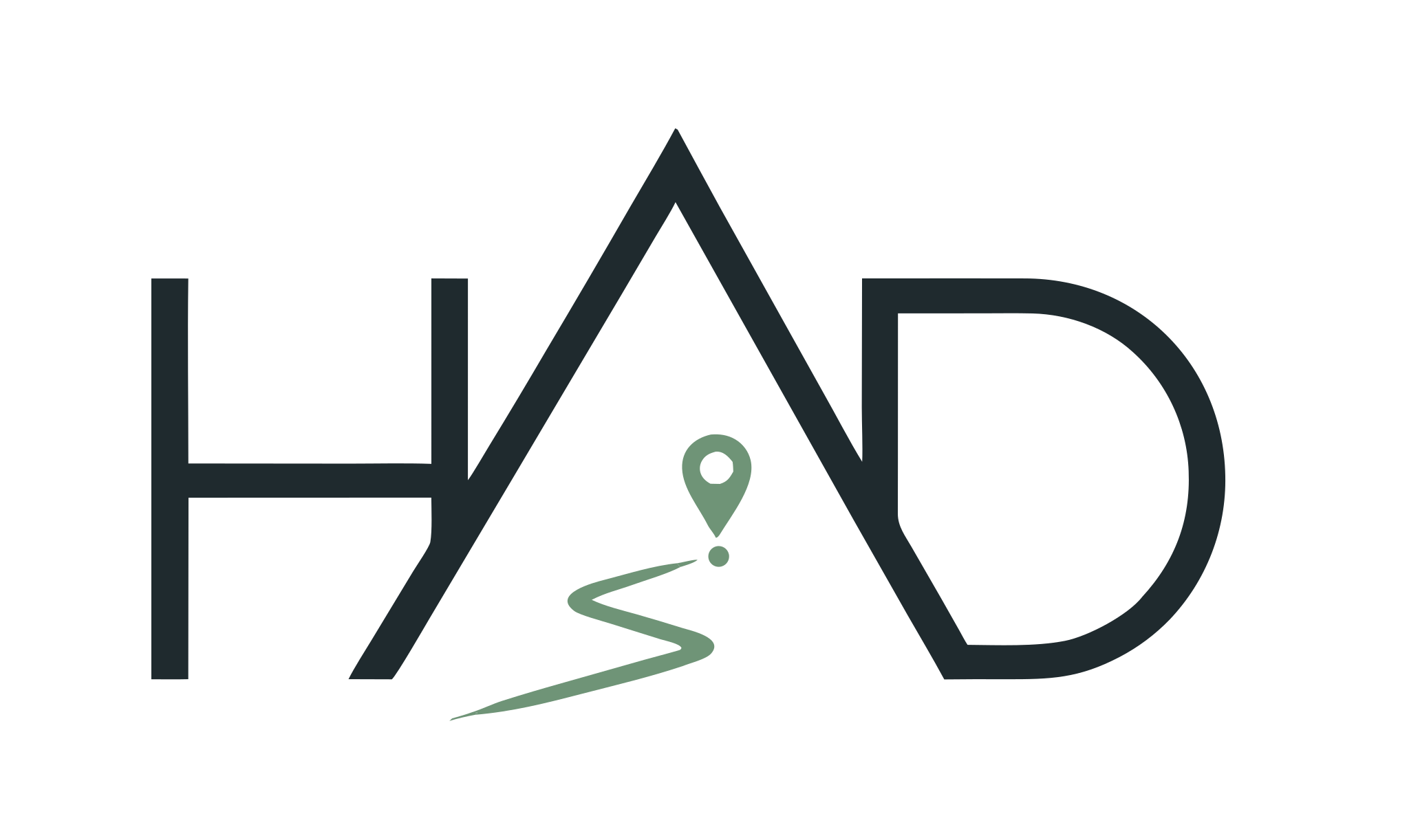
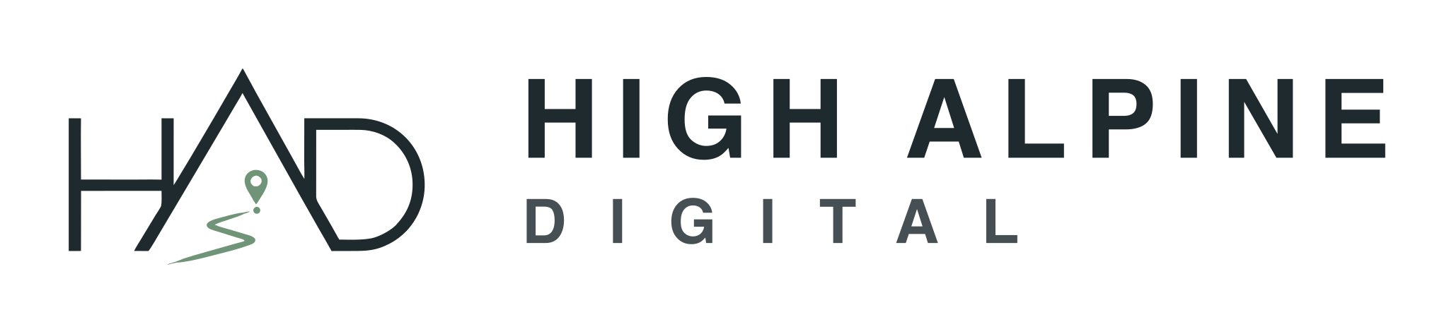
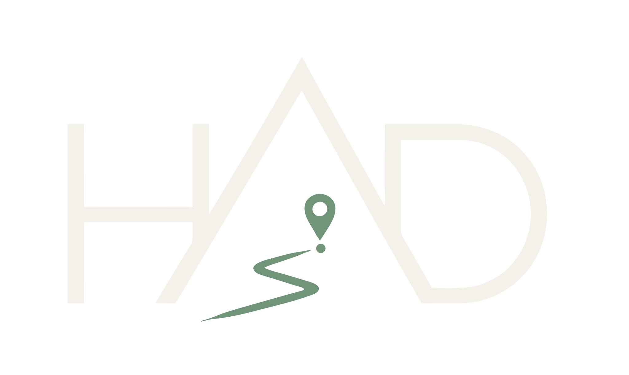
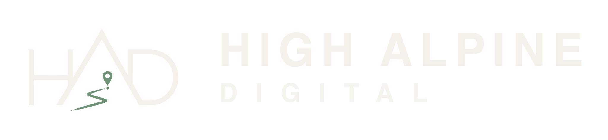
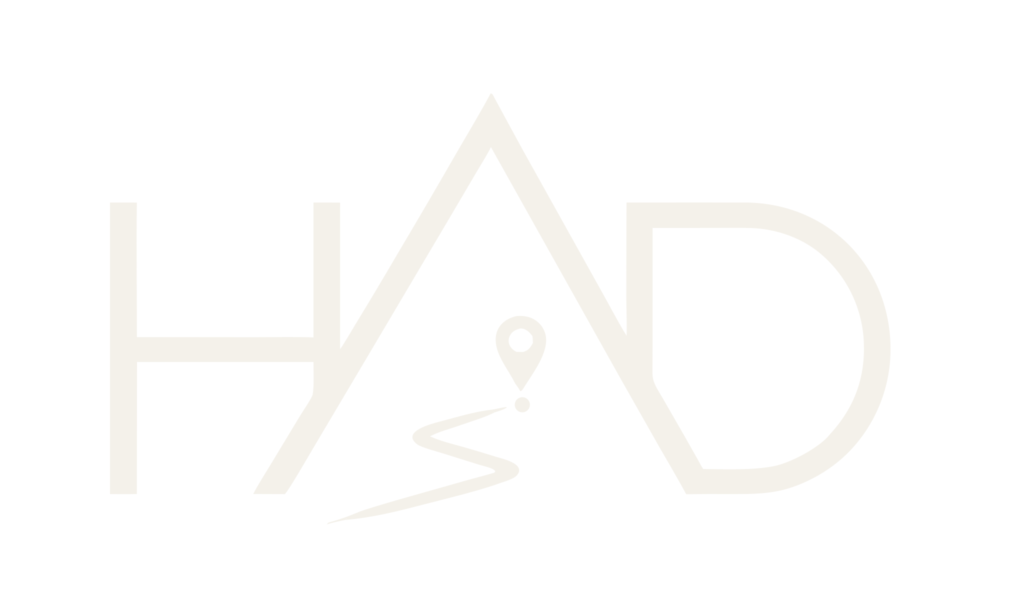
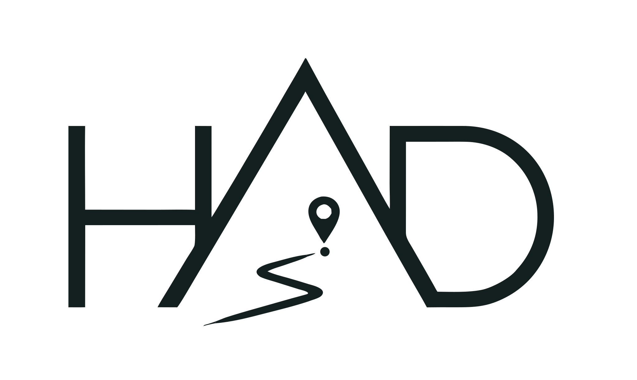
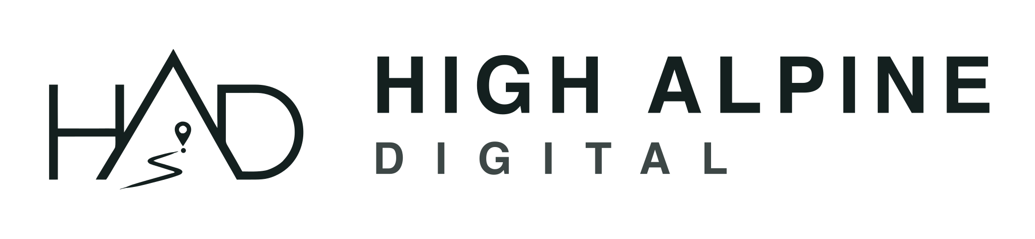
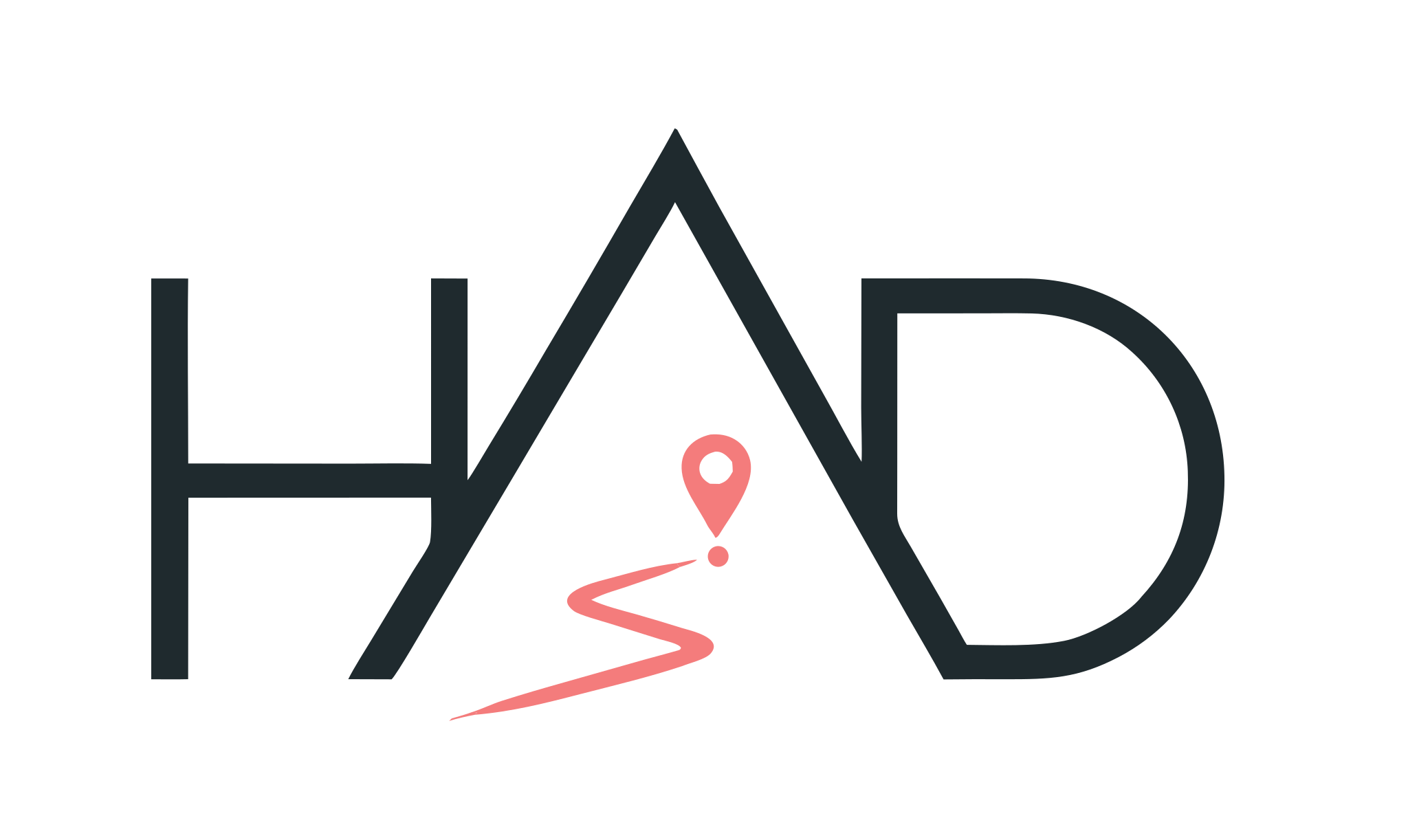
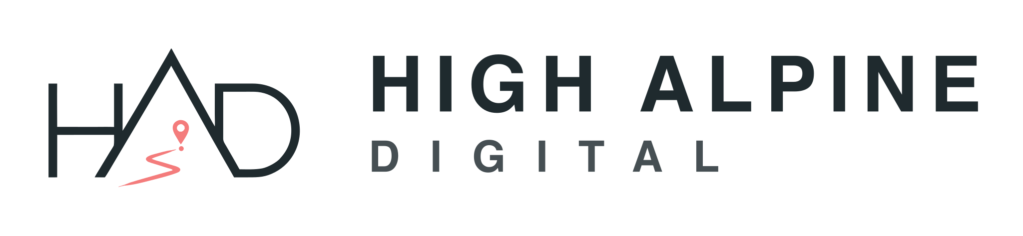
The logo
The HAD monogram carries the whole idea: the pin (location → strategy), the route (the journey → execution) and the peak (the summit → growth). It adapts to light and dark backgrounds.
Vector files for print and screen. Use the dark mark on light backgrounds and the light mark on dark; keep generous clear space; never recolour or distort.


Do — give the mark generous clear space; use the dark mark on light backgrounds and the light mark on dark.
Don't — recolour, stretch, rotate, add shadows, or place the mark on busy imagery without a clear backdrop.
Colour palette
A restrained, warm palette. Slate and cream are the base; sage is the brand; rose and coral are accents; peach is a soft highlight. Colour appears with intent — never everywhere at once.
- #1F2A2E
Alpine Slate
Base dark · primary text
- #F4F1EA
Cream
Light base · paper
- #97B49A
Sage
Primary brand accent
- #E84D5B
Rose
Primary call-to-action
- #F47C7C
Coral
Secondary accent
- #FFD8B6
Peach
Soft highlight
Typography
Display · Bricolage Grotesque
Find Your Route to Growth
Weights 200–800 available · headings set in 600 (Semibold)
Accent · Instrument Serif (italic)
Route · Growth · Summit
Weight 400 (Regular) · italic only
Body · Schibsted Grotesk
We combine marketing, automation, AI and customer experience into one seamless ecosystem that helps businesses generate more revenue while reducing manual workload.
Weights 400 (Regular) · 600 (Semibold)
Merch
The brand, worn — the HAD monogram on everyday alpine essentials. Concept mockups for a future drop.
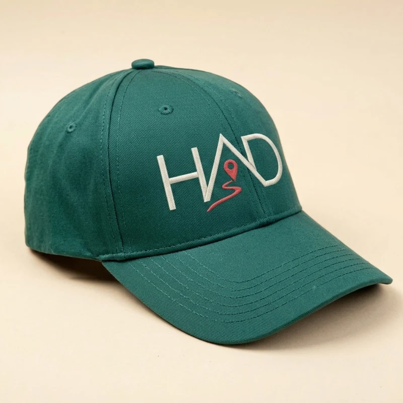
Cap
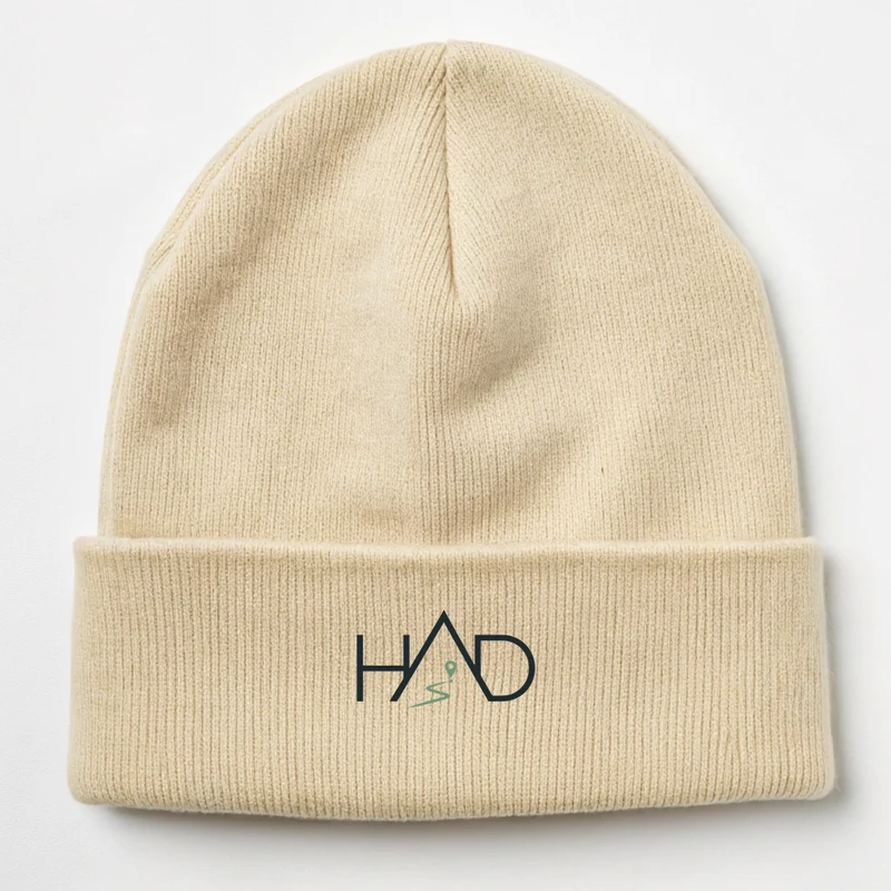
Beanie
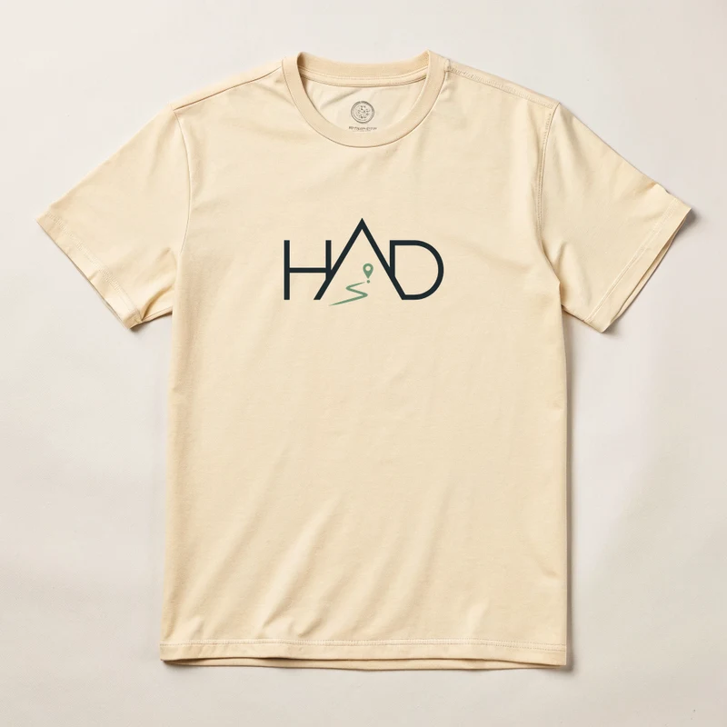
T-shirt
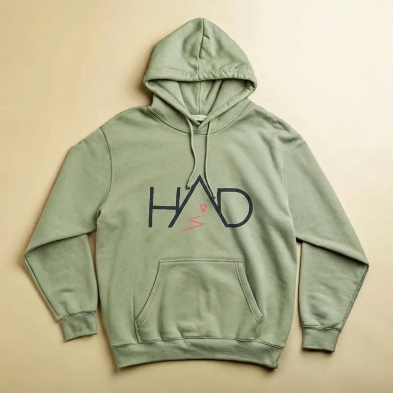
Hoodie